Optimizing our Website: A Design Journey

By Michelle Kim
Welcome to the new VideoAmp.com.
Building a website from the ground up requires an incredible amount of teamwork. I am so grateful for everyone that has helped produce this new website; our internal teams, our clients, our creative agency partner and our video team. From auditing our old website, refining our brand and crafting the perfect new story — the collaboration with different teams is a big reason this is one of the most rewarding projects I have worked on.
The VideoAmp website project was broken out into many phases, but I’d like to feature just a few of them here through the five cultural tenets of our company.
1. People First
As this project is a long-term commitment, finding the right people to synthesize our brand correctly was crucial. An official project RFP was sent to top-tier agencies from NYC, LA, all the way to the United Kingdom and France. We were on the hunt to find the best strategic and creative partner to bring the new website vision to life. After many interviews and careful deliberation, we chose to work with Column Five Media (C5). C5’s team was equally focused on being people-first in their approach to building a website and the immediate connection between our visions was clear.
Working weekly, often daily, with the C5 team, has been the highlight of this project. With all the moving parts and individual tasks, C5 never missed a beat — we could not have asked for a better partner. Together we worked to craft our story, design effective new pages and showcase everything that VideoAmp does best. I extend the most sincere thanks to the C5 team: Abheeth Salgado, Brian Wolford, Erika Imberti, Jason Lankow, Megan Lieberman, Nate Butler, Phuong Dinh, Tommy Buzelli, and Travis Keith. You have not just been working partners, but true friends and a creative extension of our VideoAmp design team.
Working weekly, often daily, with the C5 team has been the highlight of this project. With all the moving parts and individuals tasks, C5 never missed a beat — we could not have asked for a better partner. Together we worked to craft our story, design effective new pages and showcase everything that VideoAmp does best.
Something missing from our previous website was a highlight of the clients that we serve. In the new About Us video, some of our clients explain first-hand, what it is like to work with the VideoAmp team. You learn about the bonds that the VideoAmp teams create with our clients and how they directly help clients reach their business goals. Client success and satisfaction are taken seriously at VideoAmp. We could not be prouder of our Client Success and Sales teams for building trust and camaraderie, in and outside of the office, that keeps our clients winning.
Another goal of the new website was to ensure that we show off our most valuable asset; our people. The teams here at VideoAmp are made up of highly ambitious and caring individuals. Our company has a winning culture that is nurtured through people-focused initiatives and relationships that extend past the office walls. We celebrate our special team members through our featured employee sections, personal blog content and bespoke videos.

2. Challenge Paradigms
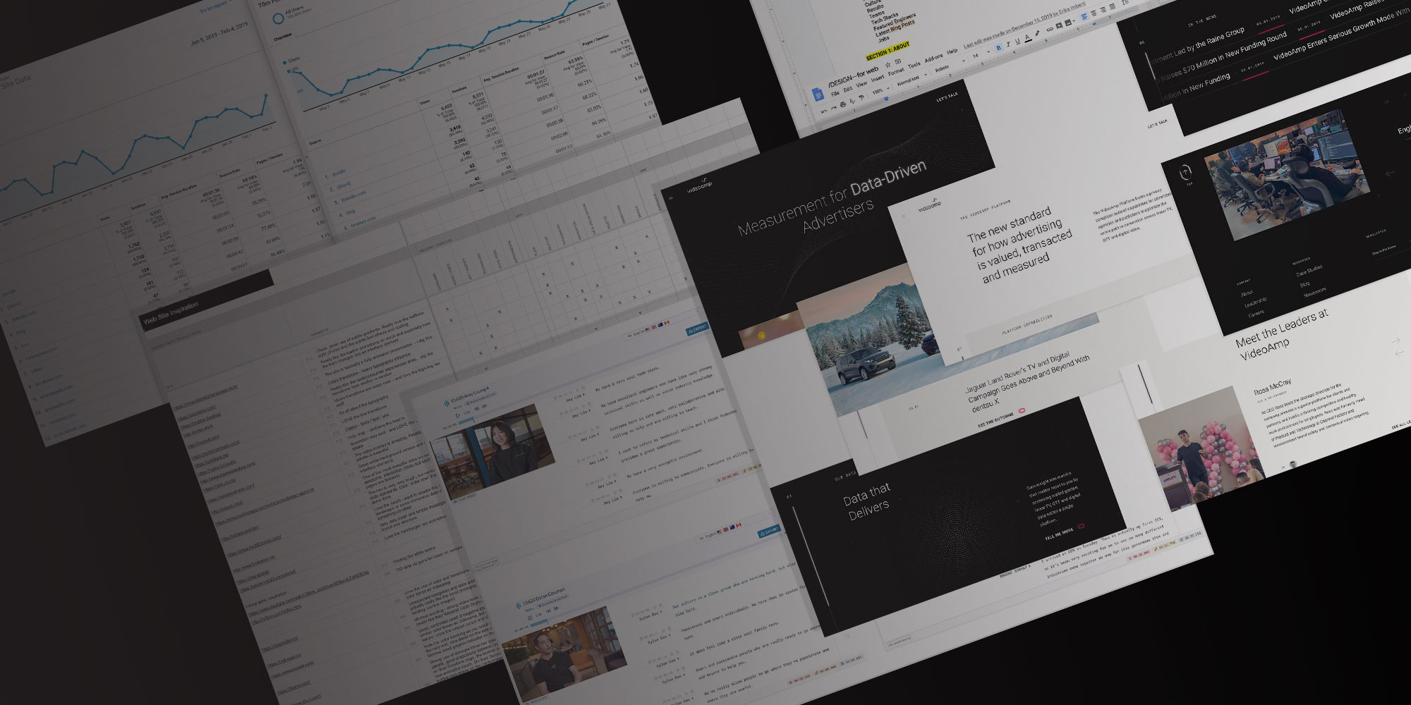
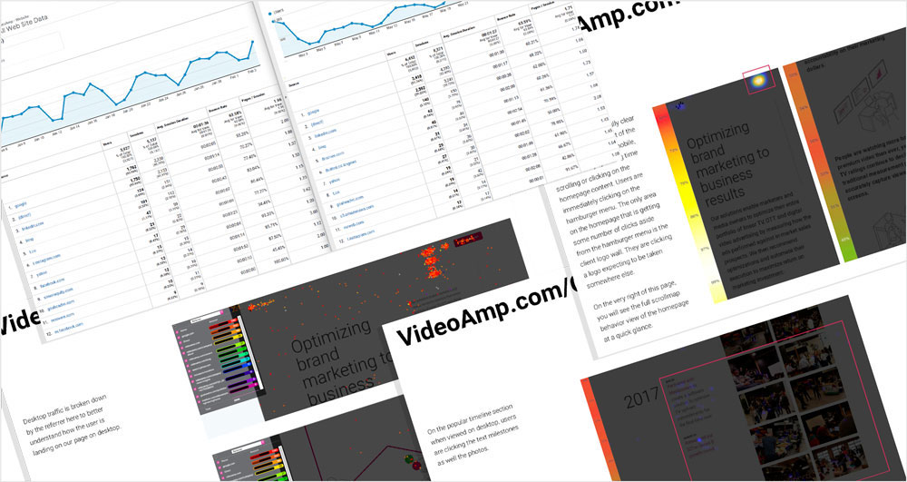
During the ideation and pre-design phase of this project, the Design team dreamed up ways that a website could disrupt the industry and challenge expectations. As mentioned on our About page, we are not your average AdTech company and our website design is part of that statement. To start, we spent a lot of time looking at website performance in terms of the user journey, traffic sources and visitation activity. By bringing our unique culture to life and connecting meaningful content to our visual brand, we break the mold from a typical AdTech company website and challenge expectations.
We used various tools such as Google Analytics and CrazyEgg and discovered what content was most meaningful to the visitor. Looking at the visitation metrics also enabled us to strategize new visitor paths to best curate one’s experience. Also, we audited websites across different industries for inspiration and built our new website to include unexpected design moments paired with more concise messaging. You can read more about intentional thought behind the VideoAmp brand design approach here.

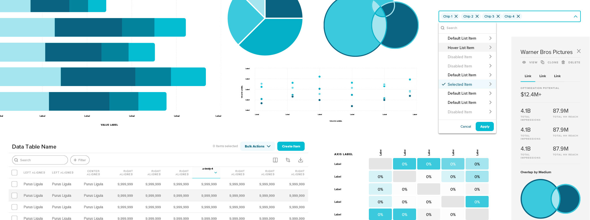
Most importantly, we are now able to highlight the sophistication and value of our Platform and the data that powers it. Through the new Platform and Data pages, we showcase our solutions, capabilities and the people that make it all happen — our Engineering and Product teams. Their agility and foresight allow them to constantly improve ways to solve our clients’ problems and challenge the status quo. Our Platform continues to be faster, more accurate and efficient thanks to these mighty teams.
3. No Bullshit
There is so much subjectivity to visual design; it is human nature to interpret something you see differently from the next person. To make effective design decisions for a business, with the least amount of bias, one must always collect and follow the data. Following the data results in meaningful designs that convey the correct messages to the right people — and ultimately leads to real business outcomes. If it looks “pretty” and doesn’t communicate a message, there is no point. If there is meaningful content but it is hard to interpret, it is not effective. It needs to be a married effort between design and content.
All of the details are intentional. Messages are concise and matter-of-fact while design interactions emphasize and pace a visitor’s journey. The website’s performance was optimized for a better experience by enabling quicker page load times, adding interactive elements and making thoughtful customizations between desktop and mobile devices.
All of the details are intentional. Messages are concise and matter-of-fact while design interactions emphasize and pace a visitor’s journey. The website’s performance was optimized for a better experience by enabling quicker page load times, adding interactive elements and making thoughtful customizations between desktop and mobile devices.
Explaining the nuances of what we do as a company is no easy feat. The design of the new website complements the language we use and hones in on what VideoAmp does, in a simple way. You do not have to be in the AdTech industry to understand what we do and how we bring value. The Marketing and Product teams go to great lengths to get this right.
4. Be Premium
In the initial audit phase of our old website, visitor data showed that many of our visitors spent time reading content about our culture, our people and leadership at VideoAmp. These were all previously static areas, so we decided to elevate these areas of interest and create curated videos. We didn’t want to create one catch-all video that didn’t dig deep. We wanted to be transparent about what it is like to work here, why we do what we do, what Health & Wellness means to us, to explaining our Platform and Engineering teams. Being premium is all about not cutting corners and not hiding behind empty written statements.
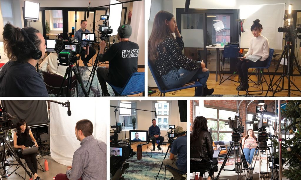
So, we’ve created several new videos that were all shot in 6K, professionally sound-mixed and color-graded. This phase of this project was particularly special for me as I was able to bring in my friends over at Station 22 for the collaboration. When working alongside fellow creatives, you want to work with people who set the bar as high as you do, and the Station 22 production team is a perfect example of premium craftsmanship and execution.

Over 10 separate days of filming were completed between LA, NYC and in Vegas for CES. In total, 34 individual interviews were conducted with 17 hours of footage captured. Piecing together the videos was like doing massive, digital jigsaw puzzles. There are many considerations when putting the videos together: getting the timing and cadence right, hitting the right messages, and adding in the B-roll to tie it all together.
Thank you so much, Noah Clark, Ula Hsu, Miguel Torres, Dayne Malan, Lars Lindstrom, Angelo Pacifici, Ryan Ramsey, Chris Boulos, Martin Kittappa, Adriana Arreguin, Josh Tousey, Terra Gonzalez, and Dalton Price. Your flexibility, positivity and pursuit of excellence are what made the videos possible.
5. Maximize Value
VideoAmp exists to help our clients eliminate waste and maximize their media investment dollars. And that is what drove a big part of the strategy behind creating our new website. We cut through the fluff and provide clear, key information. Whether they are current clients, prospective ones, we help them make better decisions when selecting a data and software solution provider. Click below to watch our new Platform video that walks you through how the VideoAmp Platform delivers real value.
VideoAmp wins when our clients win. One of the ways that you can see the value we deliver to our clients is through our Case Studies. VideoAmp’s amazing Client Success, Sales and Marketing teams work tirelessly to strategize effective campaigns for the best use of a client’s media investment.
Time is money. There is careful consideration of the time spent on our new website to maximize your visitation time and provide information that matters the most. Whether you are visiting for the first time or are a returning visitor, we believe in getting you the information you want. The new navigation, page layouts and section breaks were all designed to make your visit more meaningful.
Thank You
Creating a new website is a true labor of love. All of the personal content comes from our incredible Vampers, across all departments, who jumped in to contribute. Thank you to everyone who has been on this journey with me for the past several months. Our website could not have been built without you.
I hope you enjoy our new website that puts people first, challenges the norm, cuts through the BS without cutting corners and delivers value to our clients and employees. Now, take a look around!
