Design Deep Dive: Building a Sketch Library
By Kaleho Naki, Principal Designer
As a designer at VideoAmp, my creations aren’t only meant to be aesthetically pleasing, they are also meant to make really complex workflows easy to use and digest. When creating user interface workflows, our product engineers and designers have a daunting task in front of them and one way we are easing that workload is by creating a Sketch library. As a team, we are constantly researching, creating mocks, testing, getting feedback and iterating to get it just right. The goal? To become efficient enough so no one is road blocking anyone and everyone is working at their peak. How do we empower everyone? We create one design component library to rule them all that follows our platform’s standards, specifications and best practices to keep everyone chugging along without any second guesses.
Why a Sketch library?
In the past, the Design team would jump-start from an existing design file or start from scratch while following the style guide. But as time has gone on, things have gotten lost or changed along the way. The Sketch library was an idea for many years but we figured this would be the best time as we are growing faster than ever.
We created this library to make it easier for our small team to work efficiently to create mocks. This library also empowers the Product and Engineering teams to ideate on their own before having a design review. The library gives us the ability to create “high-fidelity” mocks so we can visualize a more final product that is easier to understand to a broader internal audience and removes visual ambiguity. Another major benefit to using a library is that it provides guidance for more consistency across the workflow and departments. It is our source of truth for creating new mocks.
Building the library
The VideoAmp platform uses our PreAmp Design System as its source of truth. PreAmp is based on Atomic Design principles and we decided to also build the Sketch component library this way. Before we started, we had to assess the current state of the platform. We audited the platform and gathered inconsistencies. While the platform was being audited we had to make the same assessment of PreAmp to cross-reference for consistency. When everything was accounted for and looked over, we got to work on building the component library within Sketch.
Just like Atomic Design and PreAmp, we organized Sketch library styles and symbols the same way. Using different pages within Sketch, we broke up Mixer, Signal, and other packages separately.

We’ve created the library with names and labels that makes customization really easy for anyone using it. Certain buttons are placed to show the user what can or can’t be “overwritten”, where certain text is uneditable and to show where color customizations can be made. An important feature that was requested was to make the components responsive so they work at different sizes when used in different areas with limited or more space. Besides smaller core components like buttons and form fields, we had the challenge of recreating bigger components like tables and modals that were resizable.
Using the library
“Using the PreAmp Library feels a lot like having a satchel of magic UX fairy dust – with just a sprinkle, we transform our concepts into reality. It has empowered our small, but mighty team to design, review cross-functionally, and iterate faster than ever before. Brain space, time, and creative energy have been freed to focus on what’s most important: the journey and experience of our users. We are big fans!” — Hannah Rahr, Senior UX Designer
“The component library is going to significantly decrease our feedback loop with clients. I can now take in the client feedback, draft up some potential visualizations and receive validated learnings at a much faster pace.” — Harrison Solomon, Senior Product Manager
“Having a design system helps our UI Engineers rapidly iterate and test and receive feedback from clients and customers without having to rebuild everything from scratch.” — David Ung, Director of Engineering, Front-End
Seems pretty magical huh?
Before anyone uses the library, we have a design training session on the basics of Sketch and then how to use the library properly based on best practices and the dos and don’ts on our internal PreAmp Design System website.
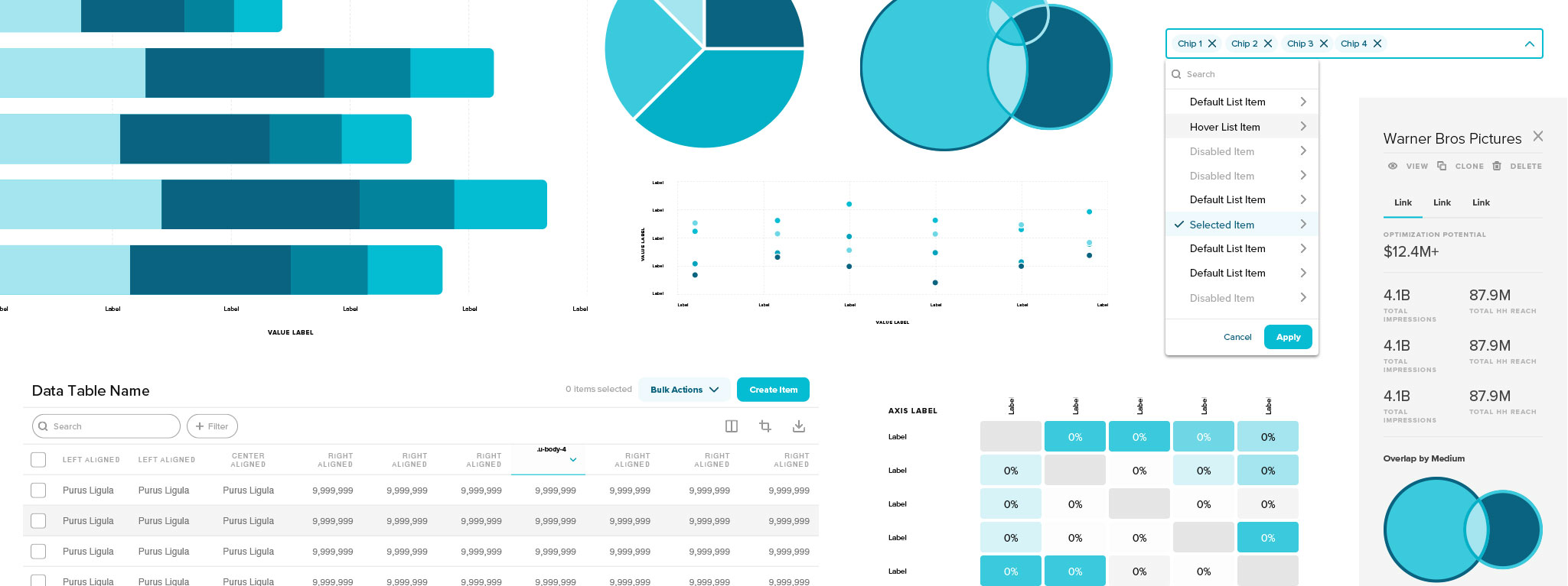
Symbols are the magic behind this Sketch component library. Think of them as component templates. The master versions of these component templates exist in this Sketch component library and whenever you use these in your document, they are instances that you can modify and won’t affect the masters.
If there are updates to the master Symbols in the Sketch component library made by the UX team, it’ll propagate to all documents using a specific symbol prompting you to update your document.

You can swap Symbols using the Components Popover in the Symbol panel in the Inspector. Choose a Symbol from the list or search for the Symbol you’re looking for and click to swap it with the currently selected Symbol.
Smart Layout maintains the padding and spacing between layers in a Symbol when an override changes its size. Once you’ve set up Smart Layout, changing an override in a Symbol’s instance will resize it automatically. When you create an instance of that Symbol and edit its overrides, Smart Layout will use the spacing and padding between layers in the Symbol Source as a blueprint and keep them consistent in your instance as it resizes.

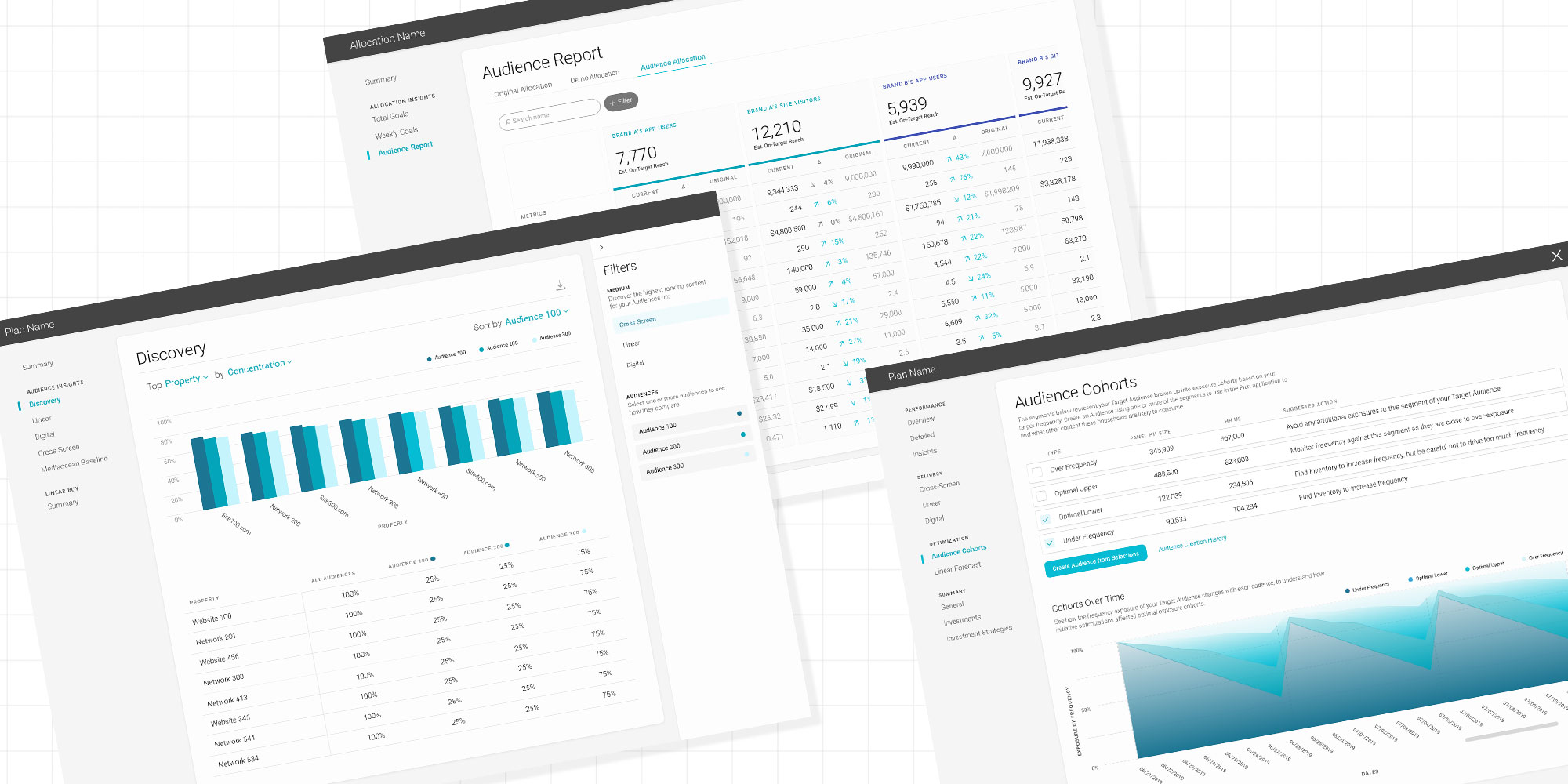
Tables within a component library can be very powerful and time-saving but can also be confusing at first with so many options and variations. We’ve created all elements that it takes to create a table within the library: cells, headers, rows, buttons, etc. With that, we’ve created pre-made tables. There are also different variations for each element so you can build your custom table within Sketch while also following PreAmp standards.
The platform uses a lot of data visualization. We wanted to keep things simple for users of the library when creating data visualization, so we use generic names and numbers for axes. As you can guess, these are also responsive to fill out a bigger section of a page or shrink down to a smaller area.

The best way to start a new UI/UX workflow is utilizing the layout templates. These are preset standard pages used throughout the platform to jumpstart your idea. There are 3 types of layouts; index, secondary and create/edit. Each type of layout has different variations. Taking the concept of Atomic Design, these are built from a combination of foundational styles, smaller components, and complex components.

Future of the library
As VideoAmp’s platform grows, so will our component library. We’ve made it so that if anyone needs or finds the use for new components, we will accommodate. And, just with everything else we do, we research, test, and iterate from everyone’s feedback.
Our design belief is to always design with intention and through this library, we hope to enforce consistency, promote efficiency and, most importantly, encourage everyone at VideoAmp to feel inspired to build their next great idea.